00 identity
heap.
Work, in one place.
heap. is a native desktop workspace for engineers — a board, a calendar, and a notebook that live in one binary and never leave your machine. The brand is built for that: calm, exact, technical without performance.
english only — one name, one mark, one voice.
01 the mark
Three nodes.
One root.
The mark is a three-node binary heap drawn at its smallest expressible form — one root, two leaves, two edges. The root is rendered in muted teal; everything else takes the foreground colour of the surface it sits on.
That's the whole drawing. It survives compression to a 16-pixel favicon, reads from across the room as an app icon, and never needs a colour beyond ink and accent.
construction
Geometry lives on a 32×32 grid. Root at (16, 9.5) radius 3.6. Children at (9.5, 22) and (22.5, 22), radius 3. Edges are 1.5 px, round caps, 55% opacity. Never recolor an edge to match the root.
02 wordmark · lockup
Lower-case.
Slate period.
The wordmark is set in IBM Plex Sans 500 with -0.035em tracking. The terminal full stop is the only differentiated glyph in the system — a single notch darker and deeper than the letters. It punctuates the name and doubles as the smallest possible brand mark.
The lockup pairs the heap mark with the wordmark at a shared cap-height, 12 px of breathing room between them, and an invisible safe-area equal to the root node's diameter on every side.
03 voice
Plain words for unflashy software.
The old tagline — heap.push(task) — was a code pun. This system speaks in finished sentences instead. The register is calm and exact: describe what the product is, what it holds, who it's for. No promises, no metaphors that try too hard.
one tagline, one descriptor, one tag.
04 color
The product palette, untouched.
Brand and product share one palette so the splash, the chrome, and the README banner all read as the same surface. Cyan is the only accent and only ever appears at small scale — the period, the root node, a focused border, a status dot.
Status hues
Brand tokens
Two extra tokens used only by the identity — the wordmark, the mark, the lockup, the icon. They override text and accent with quieter values so the brand sits behind the product, not in front of it.
05 app icon
The mark, on a squircle.
The icon places the mark dead-centre on a deep-charcoal squircle. Both the mark and the root run a stop darker than on every other surface — muted slate ink, a near-black teal — so the icon settles into a dark dock or taskbar instead of punching out of it. Generated once at 1024 × 1024 and down-sampled.
macOS · Windows · Linux · favicon
06 splash · 1280 × 800
Opening surface.
The splash is the user's first read on the brand. Centred lockup, the full tagline directly underneath in serif, a single mono status line at the bottom edge. Nothing animates except the status string.
Work, in one place.
08 marketing hero · 1440 × 900
For the landing page.
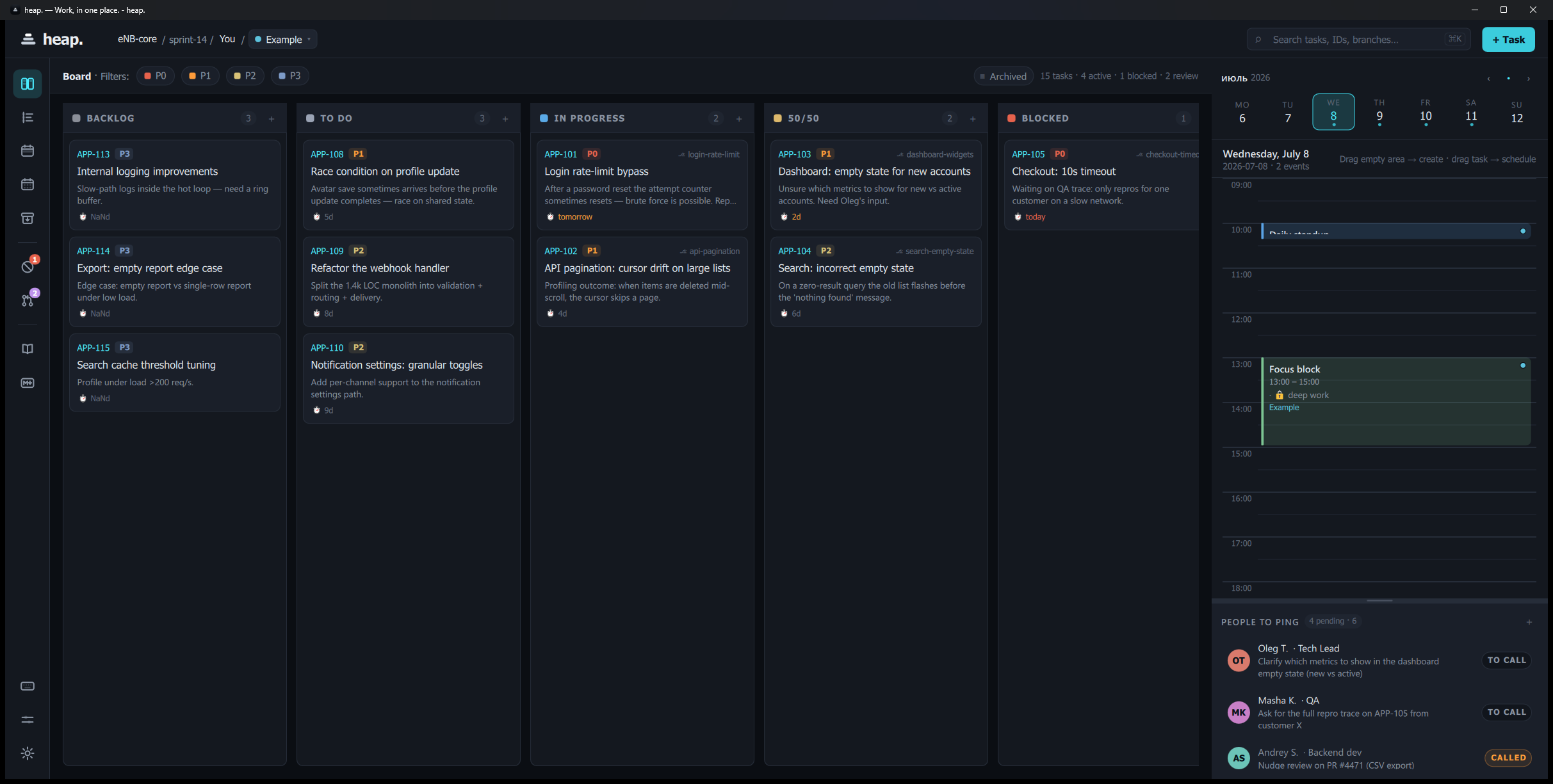
Editorial split: oversized serif statement on the left, a real product screenshot on the right at full bleed. No mockup chrome, no faux device frame, no rotated 3D card.
Work, in one place.
A native desktop board, calendar, and notebook for engineers. Everything you have to do today, on the machine where you do it.
09 og:image · social card · 1200 × 630
Square one for every link preview.
What people see when the repo URL is pasted into Telegram, Slack, Twitter, or an email. Big mark, name, one line. Don't over-design it — it's a 300-pixel preview most of the time.